Travel insurance / Research
From Comparison Tables to Conversations
What four years working for a travel insurance aggregator taught me about how people buy travel insurance
01
A Short Preface
There is a certain kind of shopper who reads the fine print. He is rare, he is usually alone, and he is almost always right. For four years I watched people buy travel insurance, and for most of that time I assumed the job of a comparison site was to make the fine print unnecessary. A good table, a clear price, a recommended plan. Done.
I was half right. People did want to skip the fine print. They just didn't want to skip the understanding. Eventually they found someone else to do it for them.
This is a case study about that shift: what I saw, how sure I am, and what I think it means for anyone who builds comparison experiences. It is a pattern observed at one company over four years. It is not a forecast, and I'd ask you to read it that way.
02
Context
I spent four years working for a travel insurance aggregator, where I was a senior user experience designer. The job was UX, but it grew to include product design and, as the company downsized, marketing. I also helped with the adventure insurance subsidiary, which taught me more about travel insurance than I had planned to learn. Over that time I took part in roughly 100 customer interviews, which were moderated, with participants recruited from Hotjar. We were originally trying to learn how people used our site, how they behaved as travelers, and what they thought about travel insurance. We were not trying to learn about AI. That turned out to be the useful part.
I also spent a good deal of time in Hotjar session recordings, which are an underrated form of company. They don't flatter you, and they don't explain themselves.
03
Observation One: The Explanation Gets Outsourced
The first sign was small. Three years ago, a participant mentioned ChatGPT. That is why I asked: he had never heard of our site. Nobody on the team made much of it.
Then it kept happening. In our first year, no participants mentioned it. In the second year, two did. In the third, ten. By the fourth, there were too many to mention.
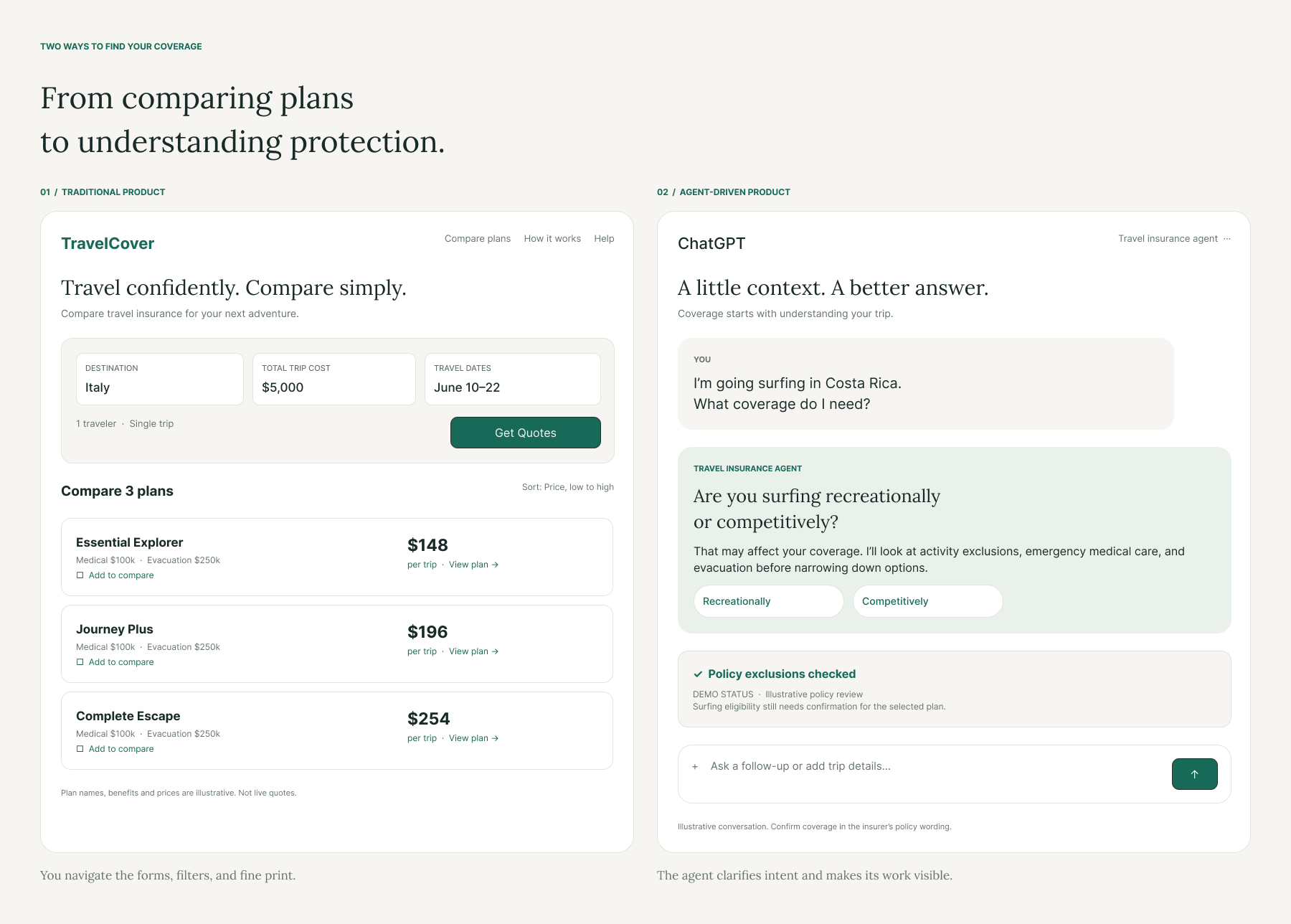
What they asked it was more revealing than the fact that they asked. The questions were not "which plan is cheapest?" Our table could answer that. They were closer to:
- I'm going to Italy with a pre-existing condition and a firm commitment to gelato. What insurance do I need?
- If my flight is late and the cruise ship leaves without me, who do I yell at, and is it covered?
- I'm heli-skiing in Norway. Does my plan cover being airlifted off the mountain I was just airlifted onto?
People used our site to find the options and used the chatbot to understand them. This is a sensible division of labor. It is also a slightly alarming one, if you are the site.
04
Observation Two: Visitors Who Weren't Quite Visitors
In the last two years, the recordings began to show something I had not seen before: sessions that looked as though someone was visiting on a person's behalf.
These sessions stood out for two reasons: a Claude label hovering over the page, and cursor movement that looked more intentional than a typical visitor's. They were not common, but their number rose in the fourth year.
In two or three of these recordings, I noticed a blinking Claude logo hovering over the page. I'll say plainly what I think this is, and what I don't know.
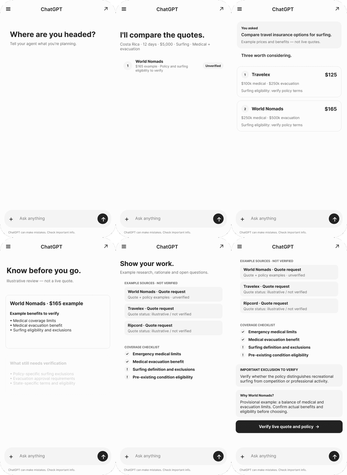
Example: Designing the agent’s decision process
- Traveler describes their tripDestination, activities, cost, concerns
- Agent identifies missing informationAsk only questions that materially affect coverage
- Is the information sufficient?NoClarify or escalateYesResearch options
- Verify policy details and compare suitabilityCoverage, exclusions, eligibility, current quotes
- Explain recommendation and request approvalTraveler makes the final purchase decision
05
What People Were Actually Buying
Here is the part I find most interesting, and the part a UX researcher is best placed to say.
The job was never "show me a list of prices." Price is the easy part of travel insurance. The hard part is a quiet, expensive question: if something goes wrong, will this actually pay?
Answering that means understanding exclusions, definitions, deadlines and conditions, which are written in a register that no one speaks aloud. A comparison table is very good at ranking. It is much less good at reassuring.
When people reached for a chatbot, they weren't abandoning comparison. They were adding the thing the comparison left out.
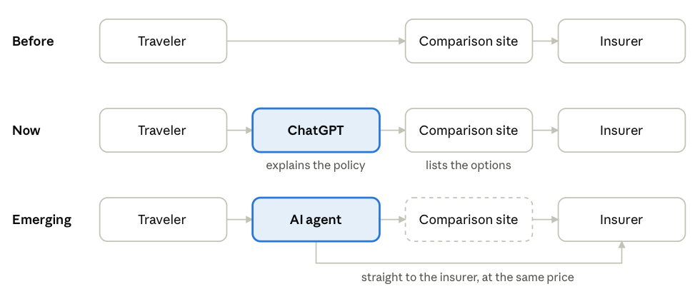
One further detail makes this plainer. A comparison site like SquareMouth or InsureMyTrip cannot price a plan lower than the insurer sells it direct. The price is the same either way, so the site's value was never the discount. It was the choosing: narrowing the field and making sense of it. That is precisely the work people began handing to an assistant, and an agent that goes straight to the insurer gives up nothing on cost.
The site once sat between the traveler and the insurer. Now the explaining often happens in an assistant first, and an agent can go to the insurer directly at the same price.
06
Implications & Limitations
Read implications & limitations
These are my inferences, not findings. I hold them with moderate conviction.
- Treat explanation as a core feature, not a footnote. If customers are explaining policies to themselves elsewhere, the explanation is where the value is moving. Plain-language coverage summaries, written by people accountable for them, are worth more than another filter.
- Make plan data readable by machines as well as people. If an agent is going to read the page, structured, unambiguous plan details will serve everyone better than a layout that works only for the eye.
- Show what happens after the sale. Claims experience is the information people most want and can least find. A comparison site doesn't take part in the claims process, so it doesn't hold that information; the insurers do. The opportunity is to close that gap, by surfacing insurer-supplied claims information or independent evaluation, rather than implying the site owns it.
- Be honest about incentives. A person delegating a choice is entitled to know who benefits from the answer. Clear disclosure of commercial relationships matters more, not less, when a machine is doing the reading.
- Design for a handoff. Plenty of customers will move between a person's judgment and an assistant's help in the same journey. The experience should survive that, rather than assume a single human at a single screen.
There is a larger business question underneath all this, which is what happens to a model built on human clicks when fewer clicks are human. I have views on that. I don't have evidence for them beyond the pattern above, so I'll leave them as a question.
Limitations
My interviews came from people recruited through Hotjar, across every demographic we looked at, so I saw no obvious skew. Agent traffic is hard to identify with certainty from recordings, and my identification rests on the Claude label in a handful of Hotjar recordings, the cursor behavior in them, and GA4 data. This is one company's customers, over one four-year window, and AI-assisted shopping is still early. I am describing a pattern, not a market. It also helps to say what a comparison site does not control: it takes no part in the claims process, and it cannot price plans below what insurers charge direct. Those facts shape what the site can offer, and what an agent might reasonably route around.
07
Reflection
What I'd do differently: make the site easy for an agent to read, if that can be done. I would also stop assuming that was the whole job, since an agent can go straight to the insurer at the same price.
What I'd research next: whether being easy to read gives an agent any reason to come through us at all, or whether that only matters if we are also the best place to understand what a policy covers. I don't know. It is the question I would want answered before anyone calls it a funeral.
What I learned, in the end, is an old lesson wearing new clothes. People do not want information. They want to feel they have understood something before they pay for it. The tools change. That does not.